A winning app with a maligned icon
In looking for an alternative to the lackluster default iOS weather app Jacqui Cheng's comments led me to check out Yahoo's Weather app. It quickly became my favorite weather app. Consistently positive reviews, high star ratings, and a tool to set Yahoo Weather as the default app suggest I'm not alone in thinking highly of it.
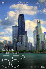
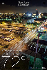
Yahoo Weather makes a strong impression by making excellent use of the Flickr library, the most traditionally underutilized of Yahoo's resources. This provides a quality visual backdrop relevant to the numeric weather data and invites users to further emotional involvement by contributing their weather-relevant photos to the Project Weather group. As such excitement moves into geographic areas with little Flickr activity it becomes doubly helpful to Yahoo! as it provides a significant improvement to the emotional quality of the experience while helping users of Flicker and Weather feel more ownership over both applications.
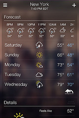
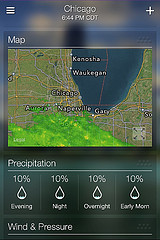
After the initial wonder inspired at the Flicker imagery subsides the app provides the tools you'd expect. A 5-day & hourly forecast display, details of current weather, precipitation radar and percentages, even information on wind, sunrise, and sunset.
Except for disappointments in poor photo coverage in less Flickr-savvy areas I've been pleased with the app. I was however surprised to find that there's something many weren't thrilled about: the app's icon.
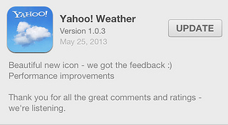
The Weather app team apparently felt the sting of numerous whines on Twitter about how people didn't like the icon. I disagree. I think the much maligned line drawing on a purple background clearly communicated the key characteristics of the app.
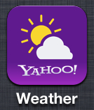
- By using the line drawing for partly cloudy that millions have learned over decades of seeing weather reports on the television and the internet the icon quickly communicates that we're talking about weather
- By using the Yahoo! purple background and keeping to it in the negative spaces of the partly cloudy image the icon clearly communicates that this is a Yahoo product
I don't think the new icon communicates either of these traits effectively. The new wispy cloud doesn't leverage prior visual experience to the same degree as the previous icon's line art. The connection to Yahoo's corporate identity comes only in the form of the Yahoo! logo emblazoned on the blue background.
It's important to help customers see that you're listening to them. The icon change may have come as an easy opportunity for Yahoo! to prove they're listening. I think in this case we get a lesser product as a result but if this change of icon helps more customers engage with the product and focus on its strengths maybe it's my turn to hold my complaints.
If you don't think so, take a look at Tristan Denyer's Is the Yahoo! Weather app icon really that ugly?