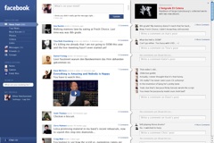
iA redesign of Facebook circa 2006
 A few years back, let's say 2006, iA put together an impressive redesign of Facebook that provides a much cleaner feel and a cool horizontal information flow from less to more specific. Filter to info stream to reaction as they put it in the article.
I dig the clear hierarchy of the columns and the clean visual quality but I have my questions about how well this approach would play for the majority of Facebook users. (I have a certain affection for MacOS Finder's column view but I recognize that many people don't care for it.)
This is one of those interfaces that I'd love to see tested with end users. Interestingly, Facebook is one of those sites (like Amazon) with a large enough user base that an interface like this could get a small scale A-B rollout and remote feedback without causing disruption for the majority of users. Keep the sample small enough and the test might not appear as an article on Mashable until you've done a couple rounds.
What do you think of this design approach?
How would your Facebook friends react to it?